Marker Layer
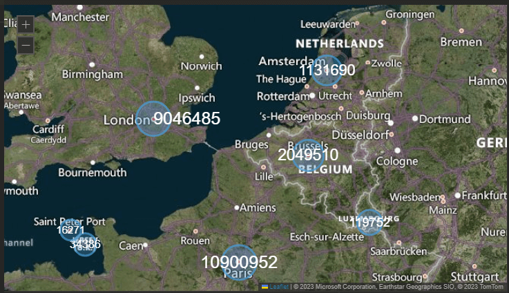
Map Marker Layer is a highly visual method for plotting point based data across your geographic layouts. Whether you are tracking the specific populations of major cities on a dedicated analyst's monitor or displaying the scale of localized incidents across a global map on your main control center video wall, this layer instantly scales markers to reflect your underlying data values. With intuitive controls to toggle between circular or rectangular shapes, apply logarithmic scaling for extreme data ranges, and fine tune specific border and fill colors, you can easily design clear, proportional map visualizations that highlight critical geographic variations at a single glance.
Example Dataset
We used capital city population data for this example. The dataset includes:
- Territory: Capital city name
- Latitude: Geographic latitude
- Longitude: Geographic longitude
- Population: Value used to size the marker
Getting Started
- Load your dataset following the steps described earlier.
- Go to the Layouts View and access the Marker Layer settings under the Settings tab.
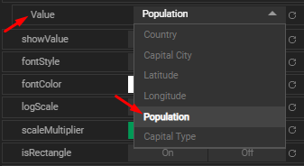
- Select the dimension you want to visualize (e.g.,
Population).
Once the value dimension is selected, the markers will appear on the map.
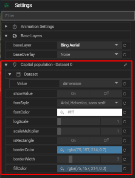
Marker Layer Settings
You can customize how your markers look and behave using these options:
- Show Value: Display the value as text on the marker.
- Font Style: Choose the font family for the displayed value.
- Font Color: Set the color of the value text.
- Log Scale: Apply logarithmic scaling to marker size. (
1= no scaling) - Scale Multiplier: Multiply the size result after applying the log scale.
- Is Rectangle: Enable to switch markers from circle to rectangle.
- Border Color: Change the outline color of markers.
- Border Width: Adjust the thickness of the marker’s border.
- Fill Color: Set the fill color inside the marker.