How to Create Data Dashboards on Video Walls
Transforming a standard video wall into a dynamic operational dashboard is critical for modern control rooms and corporate environments. Using the Lygos visual data analytics software for video walls, you can aggregate multiple data streams and display them as synchronized interactive charts scaling across millions of pixels.
This guide will walk you through the entire process of building, configuring, and deploying comprehensive data dashboards onto your video wall displays.
1. Setting Up Your Video Wall Environment
Before creating your analytics, you must setup your video wall and screens. Open the Display Module and create a new Screenspace. This process virtually groups your separate commercial screens into one unified canvas. You can then configure the inner grid dimensions of your layout by assigning slots, determining exactly how many visualization slots will be available for your dashboard collage or load visualizations after creation on your video walls and screens.
2. Creating Data Visualizations
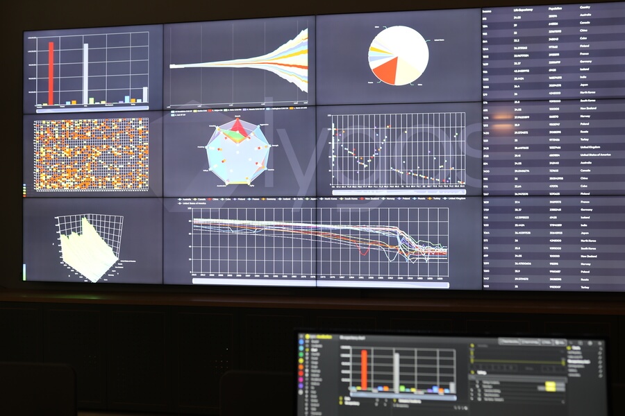
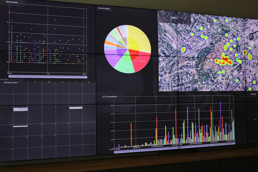
Navigate to the Visualization module to start building your analytical elements. Lygos supports over 20 different chart types. You can choose to create dynamic bar charts, complex scatter plots, thematic heatmaps, or prominent KPI value indicators designed specifically for quick glance metrics.
3. Loading Your Data Sources
A powerful dashboard relies on accurate information. Through the Data Module, Lygos allows you to connect a wide variety of sources to fuel your visualizations.
- Importing Files: Use the Spreadsheet editor to manually upload static datasets in CSV, Excel, XML, or JSON formats.
- Utilizing File Watch: For constantly changing local data, configure FileWatch to monitor specific files on your server. Any external modifications to these files are instantly streamed as live updates to your dashboard.
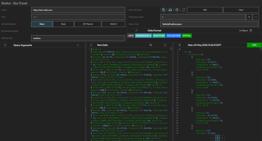
- Connecting REST APIs: Set up automated background polling from external REST APIs to bring in live operational metrics and third party service statuses. Alternativaly, you can open RestAPI access points on Lygos Server from RestService module to external systems to push/dump data to your visualizations.
- Streaming from Databases: Create secure connections to your internal relational databases like PostgreSQL and MySQL, or NoSQL databases like MongoDB. The system will continuously query these sources based on your specified data window parameters.
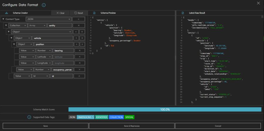
4. Defining Format of Data
Use our innovative and easy to use data format user interface to specify which dimensions of your data sources will be made available to your visualizations and what kind of data each dimension has.
5. Connecting Data to Your Visualizations
Once your sources are loaded adn formatted, return to the Visualization Editor. Open the Data and Logic tab to integrate your new datasets. By toggling the specific dataset on within the Datasets and Transform section, you instruct the visualization engine to process the incoming metrics and prepare them for visual rendering.
6. Configuring and Styling the Charts
To make your dashboard readable from across a control room, you must properly format your charts. Map your data dimensions to the appropriate axes and apply logical filters or sorting rules to eliminate unnecessary noise. Use the Base Parameters settings to customize color schemes, adjust text sizes, format legends, and align the visualization background with your overall corporate branding or dark mode environment.
7. Deploying Single Visualizations to Screens
With your first chart fully configured ready to deploy to screens, go to Display module or click the Deploy button directly within the editor. Select your target Screenspace, assign to a predetermined slot or swap with an existing visualization. The chart will immediately appear on the physical video wall.
8. Expanding Your Dashboard Elements
A true dashboard provides a comprehensive operational overview. Repeat the creation, data connection, and configuration steps for all your required metrics. Build a diverse library of line graphs, pie charts, and data tables so you have a complete toolkit of visual analytics ready for deployment.
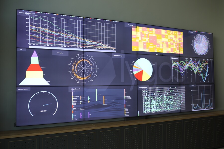
9. Building the Complete Dashboard Collage
Head over to the Display Module to finalize your dashboard layout. Select your active Screenspace and open the layout editor. Here, you can drag and drop all your newly created visualizations into the various grid slots. You can resize specific slots to make critical KPI indicators larger while keeping secondary data tables smaller, creating a perfectly balanced multi chart presentation.
10. Remote Control and Interaction
Dashboards built with Lygos are not static images. Using the Control Module, operators can actively control and interact with the deployed charts. By using into the Control Dashboard via a desktop PC or scanning a Control QR code with a tablet, users can remotely pan across timelines, zoom into specific data clusters, or utilize the mobile air mouse feature to highlight specific metrics during team briefings.
11. Animating Time Series and Real Time Data
Bring your dashboard to life by enabling dynamic data playback. If your connected databases or APIs include temporal information, you can use the animation controls to play back historical trends over a specific time interval. For live operations, ensure your data window is set to Realtime mode so incoming data points instantly update your charts, keeping your entire video wall perfectly synchronized with current events.