How to Animate Data on Control Room Video Walls
Analyzing historical trends and tracking evolving incidents requires the ability to visualize data dynamically over time. Using the Lygos visual data analytics platform, you can animate temporal data across high resolution video walls in your control room. This allows operators to review past events, monitor changing asset locations, and present time series metrics seamlessly.
This guide explains how to prepare temporal data sources, configure animations on both geographic maps and analytical charts, and synchronize their playback across your entire operations center.
1. Establishing the Video Wall Architecture
Before animating any data, you must define the physical display area. Open the Display Module and configure a new Screenspace. This process logically groups your distributed commercial screen nodes into a single unified canvas. By assigning your screens to a Screenspace, the Lygos software ensures that all subsequent visual animations render smoothly and synchronously across the entire video wall grid.
2. Loading Temporal Data Sources
To animate visualizations, your underlying data must contain time based information such as timestamps or dates. (This can be in units of UTC milliseconds since 1970, or other date time formats that can be parsed into a timestamp). For dynamic data sources such as RestAPIs, Databases or FileWatch, Data retrieval/push time serves as the timestamp of the data, if no other timestamp value is defined on the datapoint. Using the Data Module, you can load various sources and configure their Data Windows to retain historical data points for playback.
- Files: Use the Spreadsheet editor to manually upload CSV or Excel files containing historical temporal data. Use the Data Format tool to assign the time dimension to the correct column.
- File Watch: For constantly updating local intelligence, monitor server files with File Watch. As new data is written to the file, it is stored in the active Data Window.
- REST APIs: Connect to external services and poll data periodically. By setting a larger Data Window capacity, the system retains older polled data to allow for historical animation. Alternatively, RestAPI access points can be created on the Lygos server by RestService module for external mechanisms to access and dump/push data.
- Databases: Securely connect to relational or NoSQL databases. Configure background polling to continuously build a rich, temporal history of operational metrics that can be played back on demand.
3. Creating Geographic Map Visualizations
Navigate to the Maps Module to build a spatial foundation. Choose your Base Layer and connect your temporal spatial data sources. Whether you are plotting moving vehicles on a Tracking Layer or observing changing incident densities on a Heatmap, the map engine will process the location coordinates alongside their respective timestamps.
4. Animating Historical Data on Maps
Once your data is connected, open the Animation tab within the Map Editor. Ensure the animation type is set to Animation rather than Realtime. You can then configure the total duration of the playback sequence. Using the intuitive playback controls at the bottom left, you can play, pause, stop, or continuously loop the geographic animation to observe movement trends dynamically.
5. Navigating the Map Timeline
Operators often need to focus on specific incidents within a larger timeframe. Within the map animation controls, you can use the secondary slider to crop the minimum and maximum temporal window, limiting the playback to a targeted period. Additionally, you can manually drag the primary play slider to jump immediately to a specific time, instantly updating all visible map layers to reflect that exact moment.
6. Building Analytical Data Visualizations
Numeric metrics can also be animated to reveal operational trends. Open the Visualization Module and select a compatible chart type, such as a line graph or scatter plot. Connect your temporal data source through the Data and Logic tab, assigning your time dimension to the X axis.
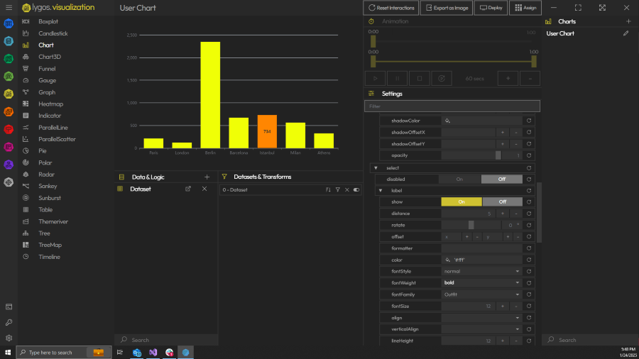
7. Animating Data Trends on Charts
To enable movement on your charts, open the configuration settings and ensure the Data Input mode is set to Animate. This instructs the chart to utilize the historical data stored in the Data Window. Just like the map interface, you can utilize the animation controls to play through your historical data points, watching line graphs draw themselves or bar charts rise and fall based on past operational metrics.
8. Exploring the Visualization Timeline
Deep analytical review requires precision. While interacting with your animated visualizations, operators can use the temporal sliders to scrub through the data. By moving the slider back and forth, you can manually step through the timeline to pinpoint the exact moment a critical threshold was crossed or a severe drop in performance occurred.
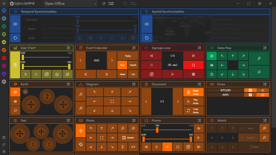
9. Synchronizing Animations Across the Video Wall
A comprehensive control room briefing requires all visual assets to tell the same story simultaneously. Once your animated maps and charts are deployed to the video wall Layout, open the Control Module.
By utilizing the Temporal Synchronization feature, you can link the time series playback of multiple distinct visualizations. This means that when an operator presses play on a tablet or scrubs the timeline to a specific hour, every connected map, sensor chart, data visualization, and Watch animation clock on the massive video wall will instantly sync. This guarantees your entire operations center reviews complex historical scenarios in perfect harmony.